Table of Contents
Tanja Gromadzki (tanja.gromadzki@techdata.com) is Ethics & Compliance Analyst at Tech Data Corp. in Clearwater, Florida, USA.
Measuring various aspects of any compliance program, including program effectiveness, is a constant journey. Increasingly, ethics and compliance departments are leveraging data-driven analysis to gauge how their program is performing. Data visualization is one such tool.
For some, the thought of visualizing data can be daunting and intimidating. But, rest assured, it’s not as scary as you think! The data visualization buzz isn’t just around compliance. Across all industries and functional areas, visualization is becoming more important due to the value and simplicity it can bring to looking at complex problems. Visualizing data helps not only those who are primarily visual learners, but it also helps to better show trends that the compliance program has developed over time as the data and the program grow increasingly more vast and complex.
How does data visualization apply?
In compliance, one area of data collected is in the form of reports received and concerns raised by the colleagues within the business, for example, help line data. This data is often shared with upper-level and executive management in committee meetings, leadership briefings, or regular touchpoints to understand what the general concerns were throughout a specific time frame. It is also leveraged to tell a story: the narrative of what transpired in the compliance program in any given quarter or other determined period of time. Other areas with a wealth of data include training statistics, data on third parties, and even data on communications (e.g., click rates).
Rather than just explaining reporting trends, you can compile data and show those trends in a way that is easy to grasp for management, because they do not necessarily look at compliance data every day. Your audience is much more able to quickly identify spikes or changes in the data and trends over time.
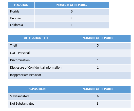
Example 1: Simple analytics in the form of tables easily show where the help line reporting came from, the allegation types for the selected time frame, and the dispositions. These tables are ideal when the data set is not extremely large (see Figure 1).
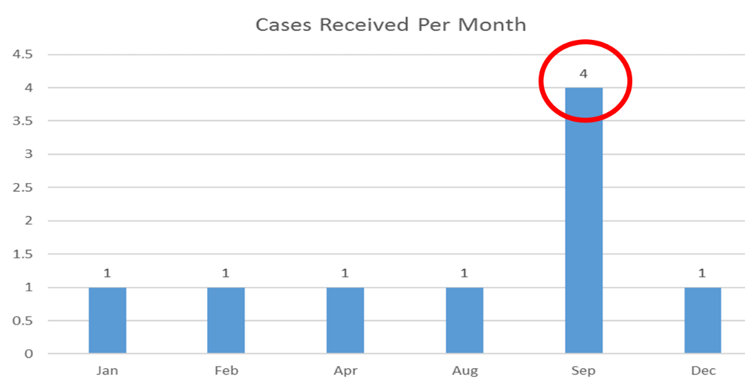
Example 2: Data visualizations are great for helping to identify trends. In the sample bar chart (see Figure 2), it is easy to see that cases were reported consistently throughout the year; however, there was a significant spike in reporting in September. It’s helpful to identify the root cause so readers understand what may have caused the spike in reporting.
How exactly do I do this?
Believe it or not, visualizing data can be quite fun! (Of course, the data visualization nerd in me is speaking when I say that, but keep in mind that there are a multitude of free resources online—including YouTube and Google—with step-by-step ideas on how to create dashboards and visualizations of data, regardless of what platform you are using.)
The trick to data visualization is to start simple. Sure, this sounds easier said than done, but it’s true! Let’s focus for a moment on a compliance program’s help line data. Start out by pulling all your reporting data into one consolidated spreadsheet that contains only the information you want to eventually show (e.g., location, allegation type, date report was received, outcome). This allows you to filter your reports by allegation type, outcome, etc.
From there you can then pull the data into separate data sets or tables that help to show how many reports were received by location and how many reports were received by allegation type. As you become more comfortable with creating simple tables, and eventually simple visualizations on a basic program like Excel, you can start to create dashboards in which multiple visualizations are depicted alongside one another to compare the reporting during a specific time frame, for example. Eventually, you can use third-party platforms like Tableau or Power BI to generate your visualizations and clean up the data.
But what are dashboards?
It’s a fun buzzword, but it’s actually quite simple. Dashboards are a one-stop shop to look at your data, broken down into different views. Once you get to this point, you have already made significant headway in the data visualization process. A dashboard is a fancy way of saying “a document that contains a variety of key metrics and key performance indicators on a single page.”
Compiling your help line reports into a dashboard allows you and your team to see what types of cases were received throughout the year, which enables you and your team to analyze and interpret trends over time. For example, perhaps your company generally has less reporting over the summer months because more people are out of the office on holiday, or perhaps a big change in organizational structure has led to an increase in reporting about management.
Data visualization also allows the viewer the see what types of allegations are most common across the organization. This helps the compliance officer to determine if additional training is necessary on certain topics or if more awareness is required in others. What data enables in these cases is for you to have a predictive approach to your program—the data should tell you where your hot spots are and where you need to focus resources.
Once you become more familiar with creating tables and pulling the data that is most relevant to you and your organization, it’s time to start becoming a little more complex. The tables that were originally created can easily be turned into graphs and charts. These visualizations will help to drive home certain takeaways or key performance indicators that you can use to compare your program to industry benchmarks.
Watch out for inconsistencies!
Keep in mind, however, that the data must be consistent and clean in order to produce effective and accurate data visualizations. What this means is that the visualization will pull out any inconsistencies in the nomenclature of the location(s), allegation type(s), disposition(s), etc. (Even one extra space in the wording may skew the data visualization due to its inconsistency with the larger data set.) So it is important for teams to agree in advance on consistent labeling and processes for the various data points to avoid having to clean up the data set in preparation for visualizing the data.
What if my company does not use data visualization?
Data visualization isn’t going anywhere. In fact, data analytics is likely to become a staple in the skill sets required of future compliance professionals. Data analytics and data visualization allows us (as compliance professionals) to display program metrics in a way that is digestible, actionable, and critical to continuous program effectiveness. Chances are, other functional areas of your company or business are already using data visualizations. Sit down with them and learn how they are curating their data and presenting it to leadership. Try to learn from them how they are visualizing and dashboarding their metrics.
Keep reinforcing the importance of data visualization by including graphs throughout your meetings with leadership or committee meetings. Hone in on the simplicity that visualizations provide. Keep in mind that data visualizations allow for viewers to quickly understand trends (much more quickly than by looking at a lengthy Excel spreadsheet). Data visualization helps to draw out the key highlights that the stakeholders of your program need to know and be aware of. Over time, these data visualizations can help to show trends on a quarterly and annual basis. Be a trendsetter and use data visualizations—and stay tuned for more on the nuts and bolts of dashboards.
Takeaways
-
Data visualization and data analytics are important tools to measure the effectiveness of a compliance program.
-
The key to data analytics and data visualization is to start simple and emphasize consistency in the labeling across the team.
-
Less is more: When visualizing data, keep in mind your audience (the stakeholders of the compliance program), because they may not look at compliance data regularly.
-
A dashboard is a document that contains a variety of key metrics, data visualizations, and key performance indicators on a single page.
-
Data visualization helps to show a compliance program’s trends over a period of time (e.g., quarterly or annually).